

MTA SUBWAY TRAIN DELAYS 2020 - 2024 PROJECT
- okanhasturkk
- May 11
- 4 min read
Updated: Jun 24
This is my Tableau project using real data from NY State data.
Dataset source: https://data.ny.gov/Transportation/MTA-Subway-Trains-Delayed-2020-2024/wx2t-qtaz/about_data
My motivation for choosing this dataset is clear. First, this is a real-time raw dataset, which I prefer to work with. Second, as in my previous projects, it is dirty data and requires cleaning and standardization. Third and most important for this project is this dataset includes time and allows to build visualization for Tableau, which is the main reason and focus here. My focus here is to analyze MTA Subway Delays during 2024 by every aspect and time intervals as possible.
In compare to the other datasets, this dataset does not require much data cleaning. The cleaning that I made is as follows.
Within the LINE column dots were added to the rows that are “S Fkln” and “S Rock”.
Within the SUBCATEGORY column spaces were added to the rows “Door-Related” and “Sick/Injured”.
Those 2 cleaning were made in Excel before importing the data to the Tableau. The only cleaning that was done within Tableau is as follows:

This was all the cleaning and standardization that was required hence the remaining data was extremely clean.
In my EDA (Exploratory Data Analysis), the goal was to the include all the elements of the dataset, which refers to the columns. The only update that I wanted to do but could not realize was converting the weekdays and weekends to days because the data was registered only under Sunday and Monday, that is why they are going to be referenced as they are in this dataset as Weekday and Weekend.
Because I was focused on the year 2024 and this dataset encapsulates a time interval between 2020 and 2024, I had to create a filter which will enable to focus only on the last year, which I generated through a calculated field that can be seen by the Tables.


After establishing my filter, I go forward with my first visualization, which is total number delays in year 2024 by month and by division. The division column represents numbered subway lines as A and lettered subway names as B. In the dataset, these divisions are represented by A and B. I updated these to numbered and lettered subway lines by editing those aliases under the division tab under Marks for better clarity.


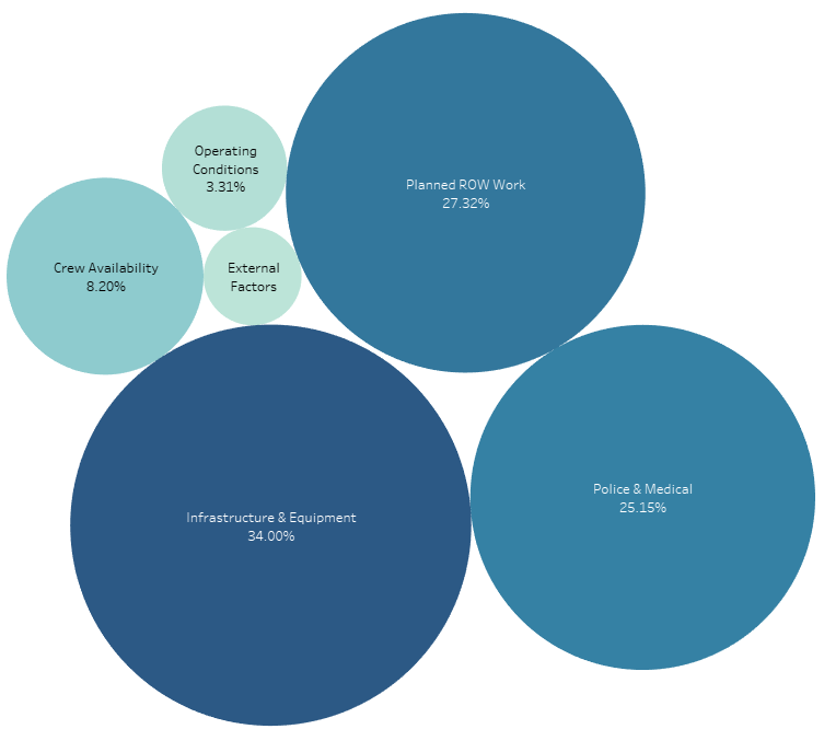
On my last visualization, I chose packed bubbles because there was an opportunity create a hierarchy between categories and subcategory, which is the perfect condition for packed bubbles. I bound subcategories to the category and updated percentages as label instead of numbers to display the reasons of the delay by categories. Let's have a look.


At the final stage of my representation, I connected all my charts to each other from the Dashboard segment under Actions, so that whenever an entry has been clicked, it can be displayed on all charts, such as:


Comments